3.2. Lesson: シンボロジー
レイヤのシンボルは、地図上の外観です。空間的な側面を持つデータを表現する他の方法以上のGISの基本的な強みは、GISを使用すると、作業データの動的な視覚表現を持っているということです。
Therefore, the visual appearance of the map (which depends on the symbology of the individual layers) is very important. The end user of the maps you produce will need to be able to easily see what the map represents. Equally as important, you need to be able to explore the data as you’re working with it, and good symbology helps a lot.
つまり、適切なシンボルを持つことは、高級でもなくまたは単に素晴らしいことではありません。実際には、適切にGISを使用して、地図や、人々が使用できる情報を生成するためにそれが不可欠です。
**このレッスンの目標:**ベクタレイヤに、あなたが望むシンボロジーを作成できるようになる
3.2.1.  Follow Along: 色の変更
レイヤのシンボロジーを変更するには、そのレイヤの レイヤのプロパティ を表示します。 landuse レイヤの色を変更するのを始めましょう。
レイヤリストで landuse レイヤを右クリックします。
- Select the menu item Properties in the menu that appears.
ノート
デフォルトでは、レイヤリストでリスト上でダブルクリックすることで、レイヤプロパティにアクセスできます。
プロパティ ウィンドウにて:
左の スタイル タブを選択します。
カラー ラベルの隣にある色選択ボタンをクリックします。
標準的なカラーダイアログが表示されます。
グレーを選択して、 OK をクリックします。
レイヤプロパティ ウィンドウで再度 OK をクリックし、色の変更がレイヤに適用されたことを確認するでしょう。
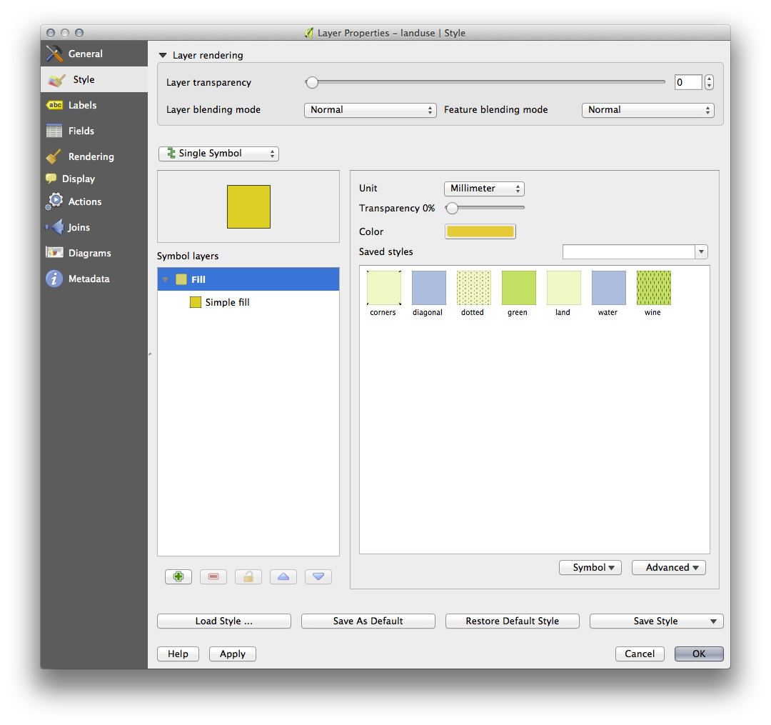
3.2.3. Follow Along: シンボル構造の変更
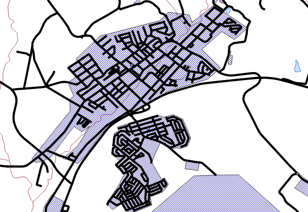
これはこれまでのところ良いものですが、ちょうどその色よりも、レイヤのシンボルに適したものがあります。次に、視覚的に雑然となるように様々な土地利用エリア間のラインを削除したいと思います。
- Open the Layer Properties window for the landuse layer.
スタイル タブで、以前と同じ種類のダイアログを確認します。しかし、今回は ただすぐに色を変更する以上のことを行っています。
- In the Symbol Layers panel, expand the Fill dropdown (if necessary) and select the Simple fill option:
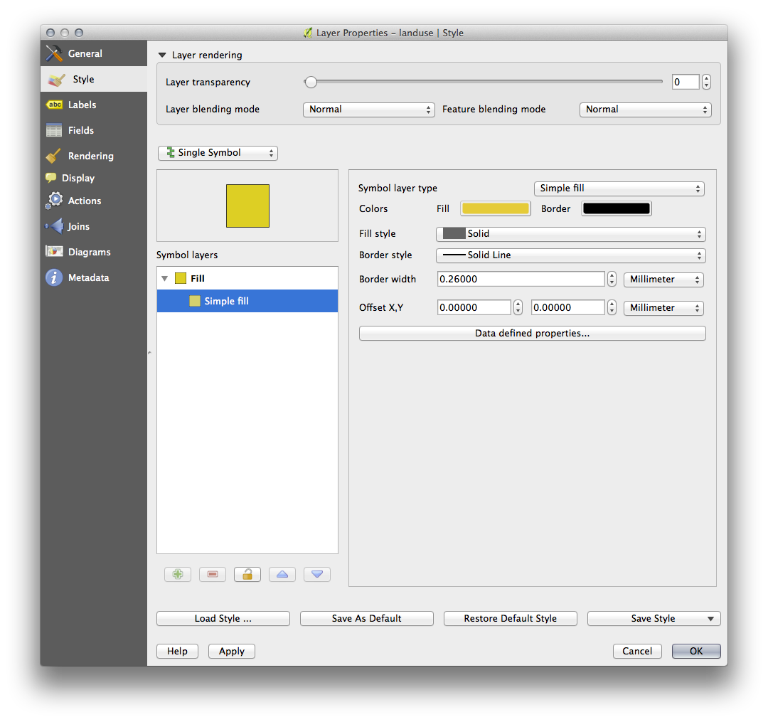
- Click on the Border style dropdown. At the moment, it should be showing a short line and the words Solid Line.
これを ペンなし に変更します。
- Click OK.
今、 landuse レイヤでは、エリア間にいかなるラインを持ちません。
3.2.4. Try Yourself
濃い青の外形線を持つため、 water レイヤのシンボロジーを再度変えます。
水路の表示を明確に表現するため rivers レイヤのシンボロジーを変更します。
3.2.5.  Follow Along: スケールにもとづく表示
Sometimes you will find that a layer is not suitable for a given scale. For example, a dataset of all the continents may have low detail, and not be very accurate at street level. When that happens, you want to be able to hide the dataset at inappropriate scales.
我々のケースでは、小さなスケールで視界から建物を非表示にすることを決定することができます。このマップは、たとえば...
…あまり便利ではありません。建物をそのスケールで区別するのは難しいです。
スケールに基づいたレンダリングを可能にする
- Open the Layer Properties dialog for the buildings layer.
一般情報 タブをアクティブにします。
- Enable scale-based rendering by clicking on the checkbox labeled Scale dependent visibility:
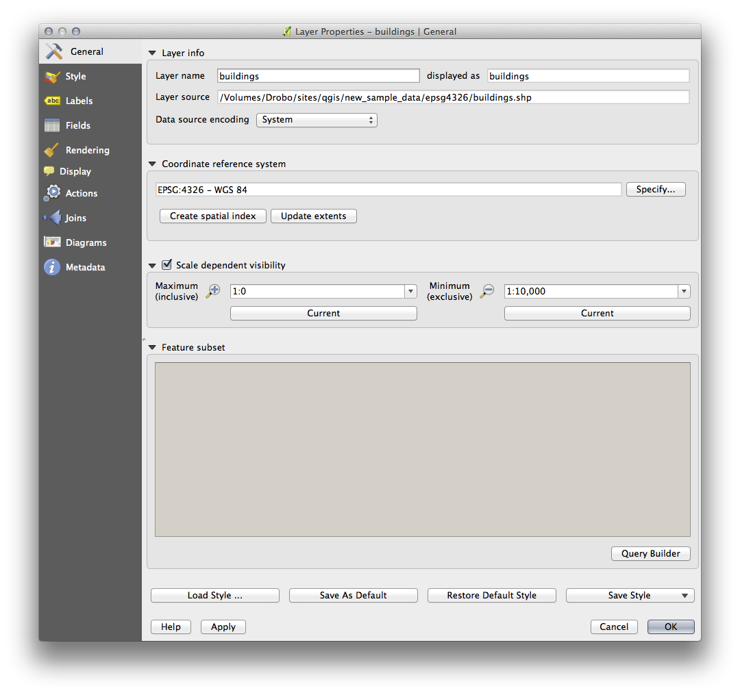
- Change the Maximum value to 1:10,000.
- Click OK.
地図で拡大・縮小し buildings レイヤが現れたり消えるのに注目することをテストします。
ノート
インクリメントにズームインするために、マウスホイールを使うことができます。 あるいは、ウインドウにズームするために、ズーム・ツールを使用してください:


3.2.6. Follow Along: シンボルレイヤの追加
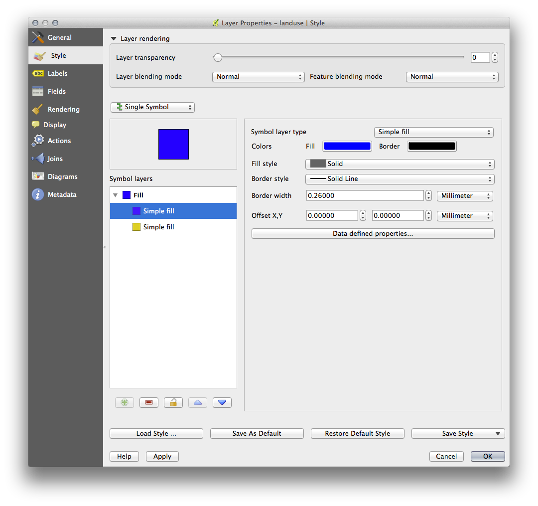
Now that you know how to change simple symbology for layers, the next step is to create more complex symbology. QGIS allows you to do this using symbol layers.
- Go back to the landuse layer’s symbol properties panel (by clicking Simple fill in the Symbol layers panel).
In this example, the current symbol has no outline (i.e., it uses the No Pen border style).
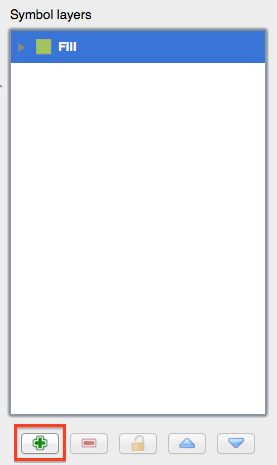
Select the Fill in the Symbol layers panel. Then click the Add symbol layer button:
それをクリックし、ダイアログがこのような見え方に変わります:
(It may appear somewhat different in color, for example, but you’re going to change that anyway.)
Now there’s a second symbol layer. Being a solid color, it will of course completely hide the previous kind of symbol. Plus, it has a Solid Line border style, which we don’t want. Clearly this symbol has to be changed.
ノート
It’s important not to get confused between a map layer and a symbol layer. A map layer is a vector (or raster) that has been loaded into the map. A symbol layer is part of the symbol used to represent a map layer. This course will usually refer to a map layer as just a layer, but a symbol layer will always be called a symbol layer, to prevent confusion.
With the new Simple Fill layer selected:
- Set the border style to No Pen, as before.
- Change the fill style to something other than Solid or No brush. For example:
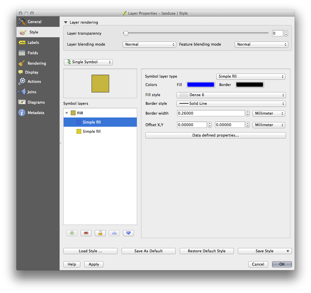
- Click OK. Now you can see your results and tweak them as needed.
複数シンボルレイヤを追加し、そのようにレイヤのテクスチャの種類を作成することができます。
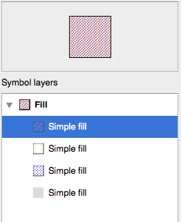
It’s fun! But it probably has too many colors to use in a real map...
3.2.7. Try Yourself
- Remembering to zoom in if necessary, create a simple, but not distracting texture for the buildings layer using the methods above.
3.2.8. Follow Along: シンボルレベルの順序
When symbol layers are rendered, they are also rendered in a sequence, similar to the way the different map layers are rendered. This means that in some cases, having many symbol layers in one symbol can cause unexpected results.
- Give the roads layer an extra symbol layer (using the method for adding symbol layers demonstrated above).
- Give the base line a Pen width of 0.3, a white color and select Dashed Line from the Pen Style dropdown.
- Give the new, uppermost layer a thickness of 1.3 and ensure that it is a Solid Line.
あなたはこれが発生したことがわかります。
まあそれは、我々が望むすべてのものではありません!
To prevent this from happening, you can sort the symbol levels and thereby control the order in which the different symbol layers are rendered.
To change the order of the symbol layers, select the Line layer in the Symbol layers panel, then click Advanced -> Symbol levels... in the bottom right-hand corner of the window. This will open a dialog like this:
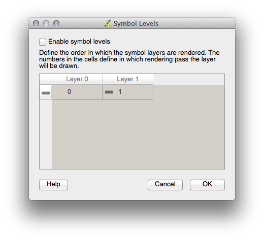
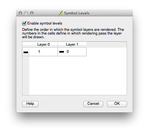
Select Enable symbol levels. You can then set the layer ordering of each symbol by entering the corresponding level number. 0 is the bottom layer.
我々のケースでは、このように順序を入れ替えたいと思います:
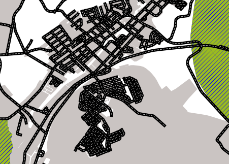
これは太い黒線の上に破線、白線をレンダリングします。
OK を2回クリックし、マップに戻ります。
マップはこのように見えるでしょう:
Also note that the meeting points of roads are now “merged”, so that one road is not rendered above another.
When you’re done, remember to save the symbol itself so as not to lose your work if you change the symbol again in the future. You can save your current symbol style by clicking the Save Style ... button under the Style tab of the Layer Properties dialog. Generally, you should save as QGIS Layer Style File.
Save your style under exercise_data/styles. You can load a previously saved style at any time by clicking the Load Style ... button. Before you change a style, keep in mind that any unsaved style you are replacing will be lost.
3.2.9. Try Yourself
- Change the appearance of the roads layer again.
The roads must be narrow and mid-gray, with a thin, pale yellow outline. Remember that you may need to change the layer rendering order via the Advanced -> Symbol levels... dialog.
3.2.10.  Try Yourself
Symbol levels also work for classified layers (i.e., layers having multiple symbols). Since we haven’t covered classification yet, you will work with some rudimentary pre-classified data.
- Create a new map and add only the roads dataset.
- Apply the style advanced_levels_demo.qml provided in exercise_data/styles.
Swellendam のエリアにズームします。
- Using symbol layers, ensure that the outlines of layers flow into one another as per the image below:
3.2.11. Follow Along: シンボルレイヤタイプ
In addition to setting fill colors and using predefined patterns, you can use different symbol layer types entirely. The only type we’ve been using up to now was the Simple Fill type. The more advanced symbol layer types allow you to customize your symbols even further.
Each type of vector (point, line and polygon) has its own set of symbol layer types. First we will look at the types available for points.
3.2.11.1. ポイントシンボルレイヤタイプ
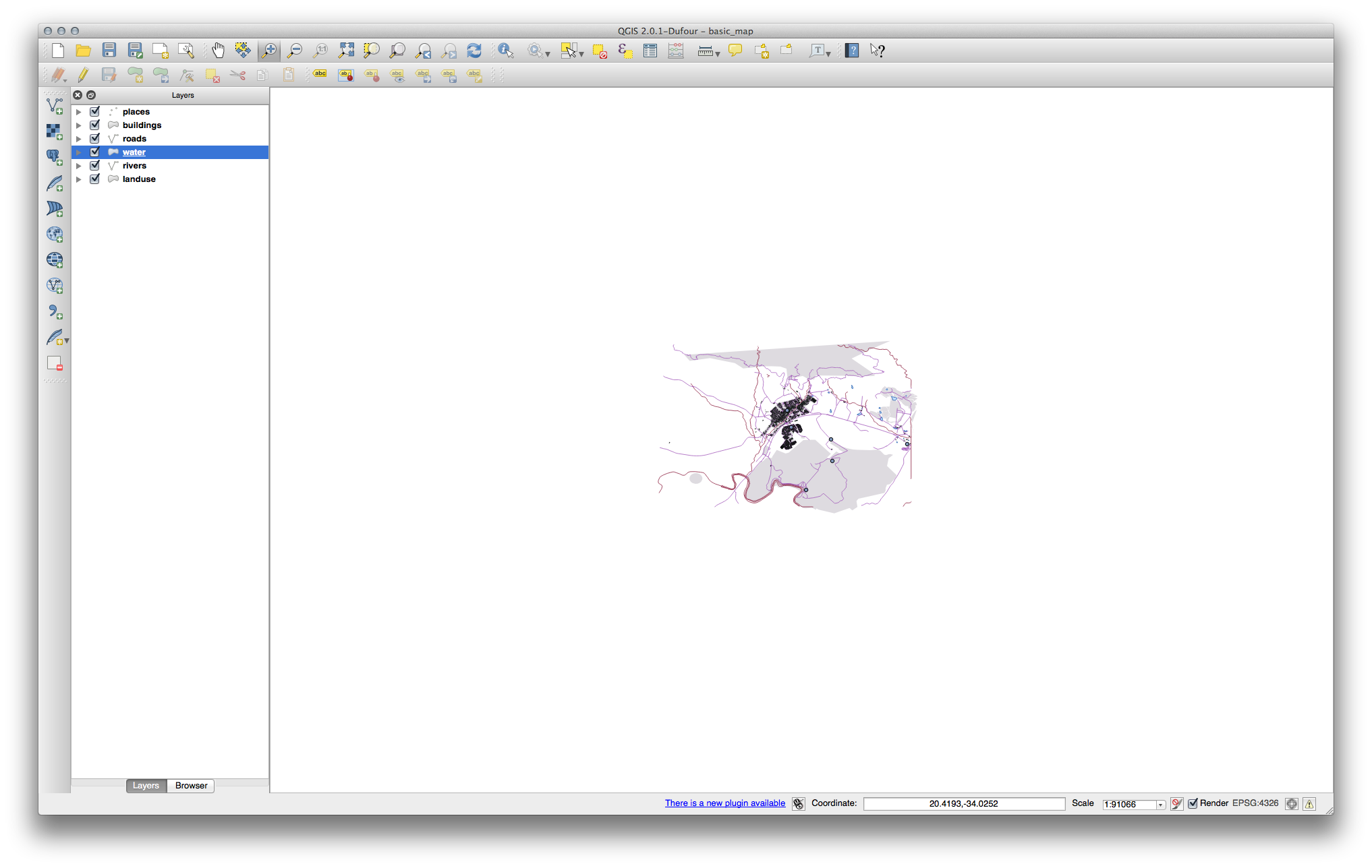
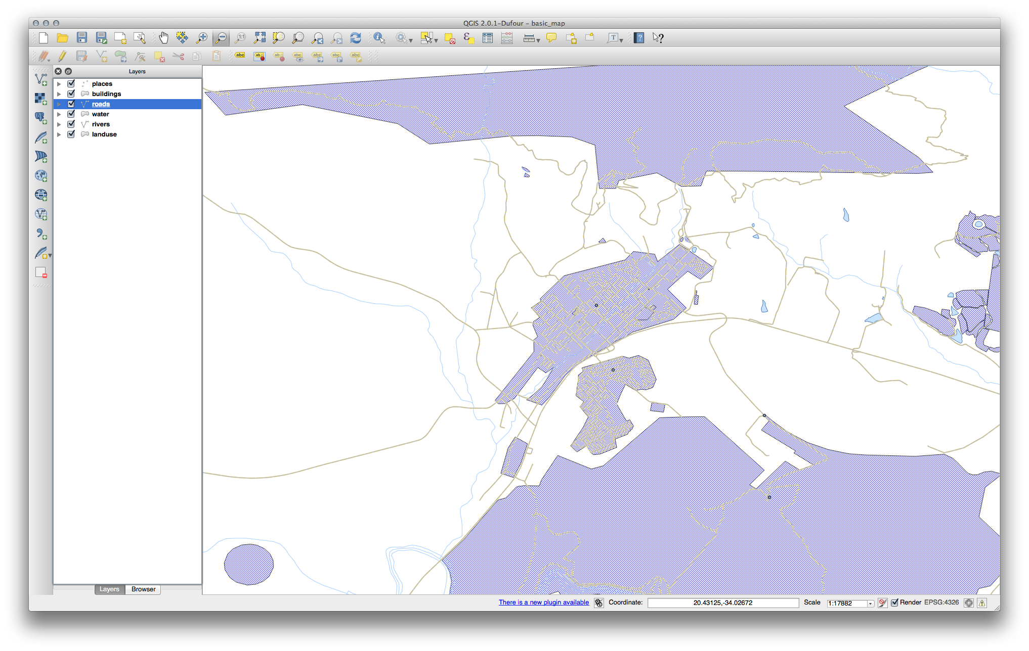
ベーシックマップ プロジェクトを開きます。
- Change the symbol properties for the places layer:
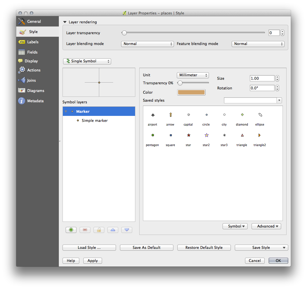
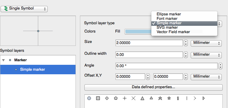
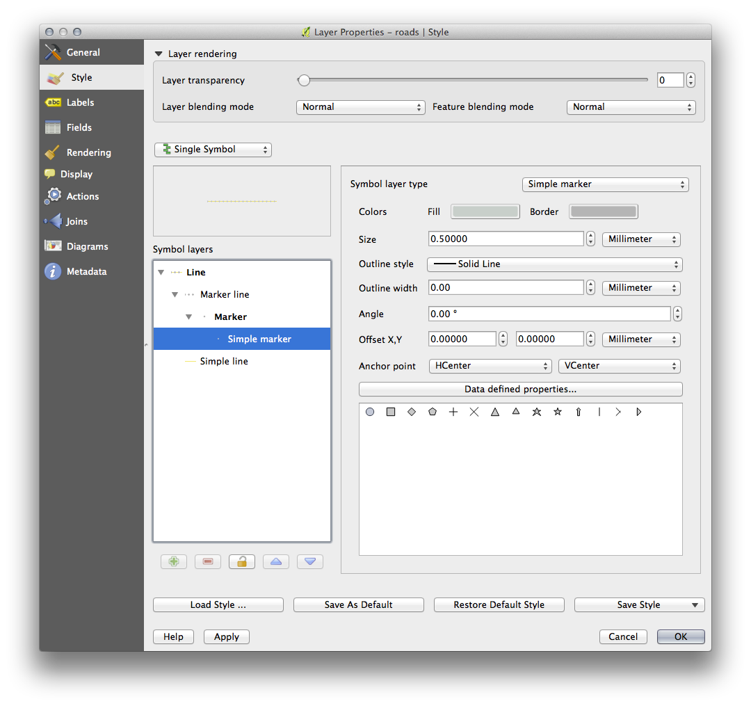
- You can access the various symbol layer types by selecting the Simple marker layer in the Symbol layers panel, then click the Symbol layer type dropdown:
- Investigate the various options available to you, and choose a symbol with styling you think is appropriate.
- If in doubt, use a round Simple marker with a white border and pale green fill, with a size of 3,00 and an Outline width of 0.5.
3.2.11.2. ラインシンボルレイヤタイプ
To see the various options available for line data:
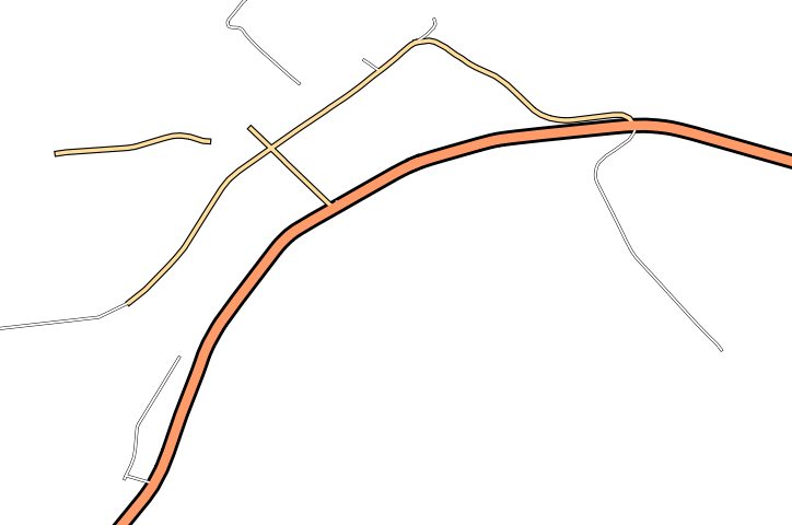
- Change the symbol layer type for the roads layer’s topmost symbol layer to Marker line:
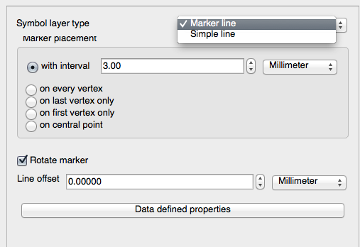
- Select the Simple marker layer in the Symbol layers panel. Change the symbol properties to match this dialog:
間隔を 1,00 に変更します:
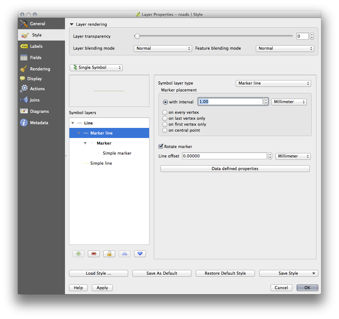
- Ensure that the symbol levels are correct (via the Advanced -> Symbol levels dialog we used earlier) before applying the style.
Once you have applied the style, take a look at its results on the map. As you can see, these symbols change direction along with the road but don’t always bend along with it. This is useful for some purposes, but not for others. If you prefer, you can change the symbol layer in question back to the way it was before.
3.2.11.3. ポリゴンシンボルレイヤタイプ
To see the various options available for polygon data:
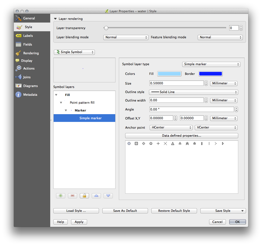
- Change the symbol layer type for the water layer, as before for the other layers.
- Investigate what the different options on the list can do.
これらのうち、適した1つを選択します。
- If in doubt, use the Point pattern fill with the following options:
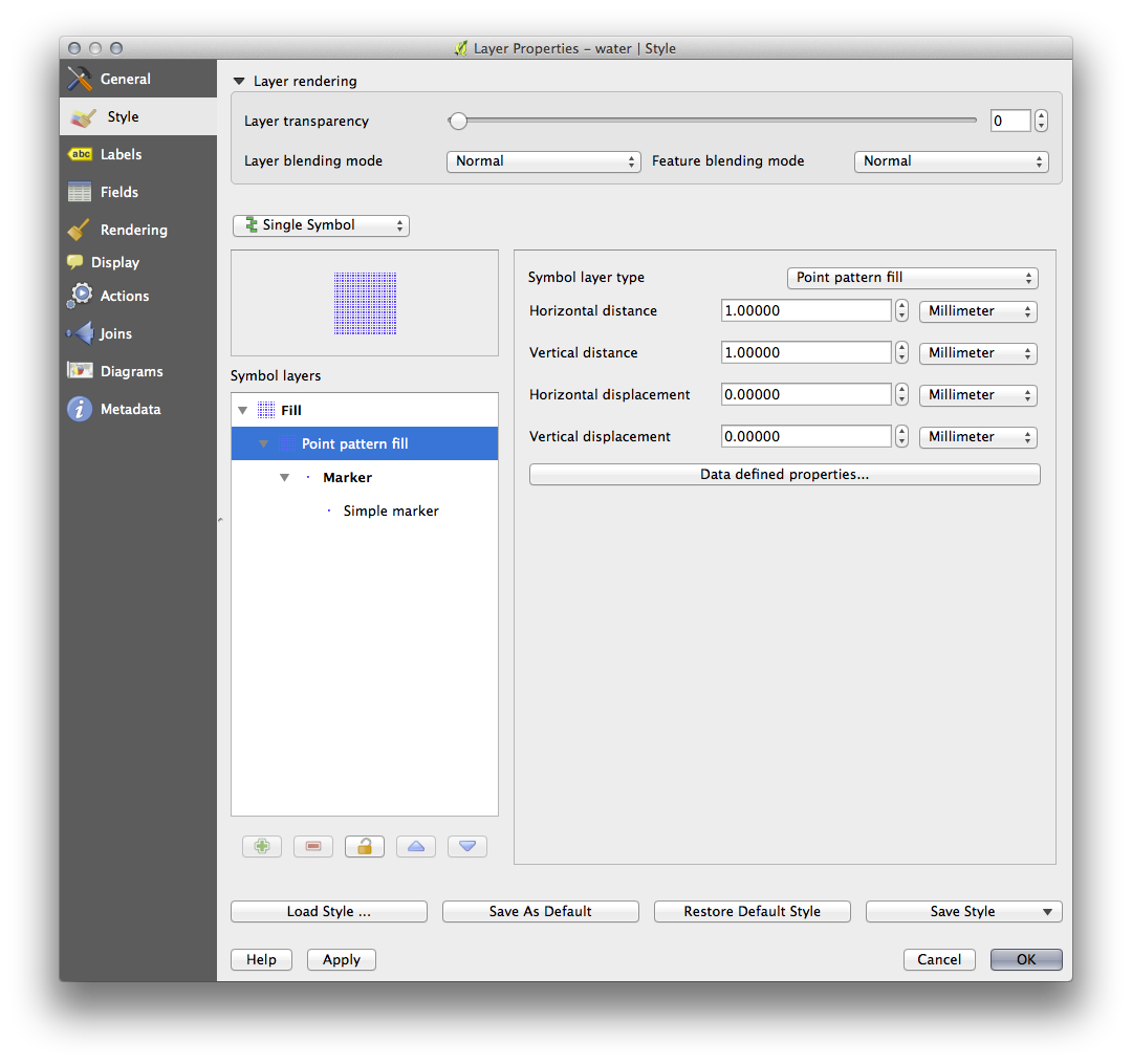
- Add a new symbol layer with a normal Simple fill.
- Make it the same light blue with a darker blue border.
- Move it underneath the point pattern symbol layer with the Move down button:

As a result, you have a textured symbol for the water layer, with the added benefit that you can change the size, shape and distance of the individual dots that make up the texture.
3.2.12. Follow Along: カスタムSVG塗りつぶしの作成
ノート
To do this exercise, you will need to have the free vector editing software Inkscape installed.
Inkscape プログラムを起動します。
以下のインタフェースを確認できるでしょう。
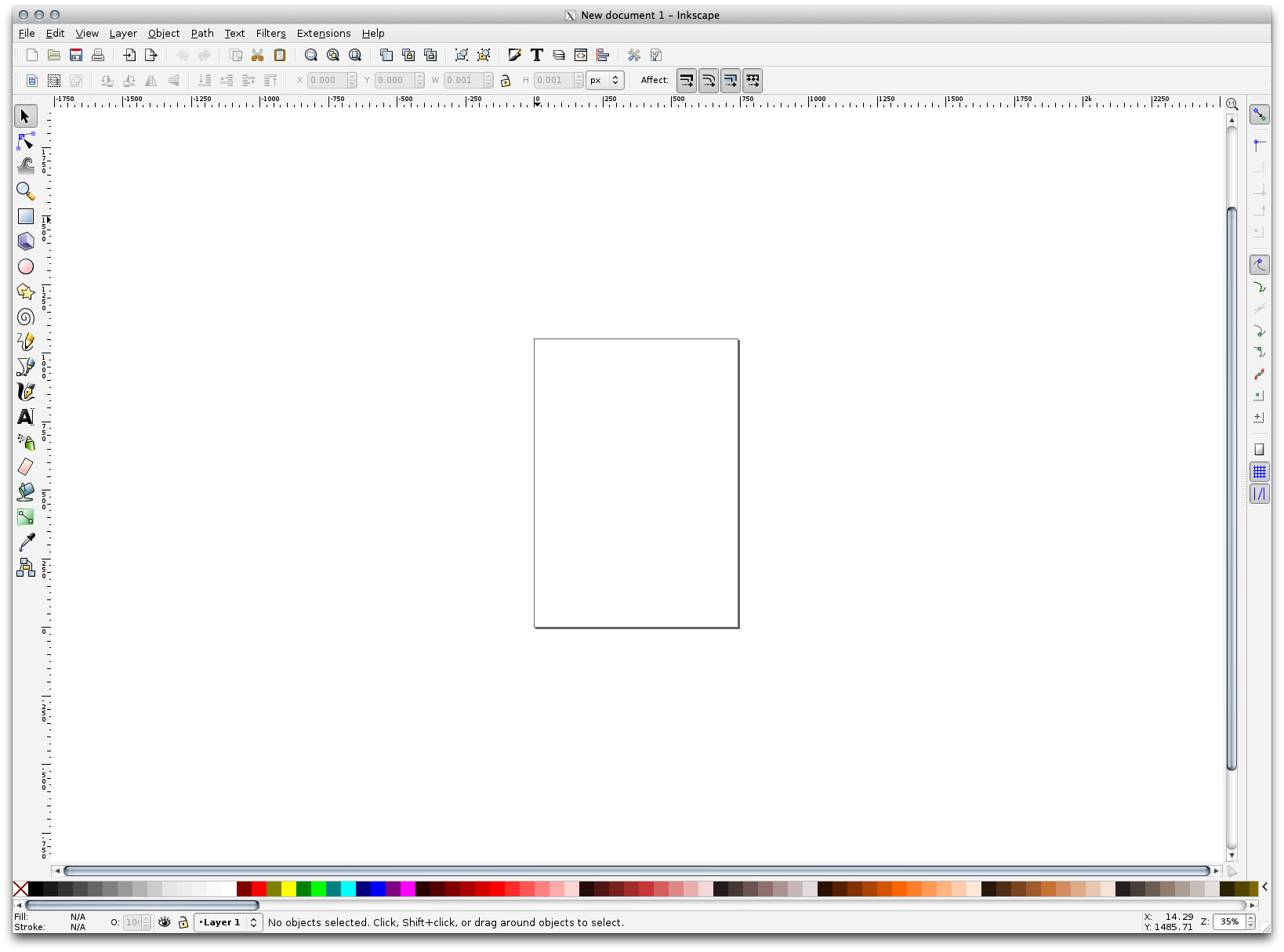
You should find this familiar if you have used other vector image editing programs, like Corel.
First, we’ll change the canvas to a size appropriate for a small texture.
- Click on the menu item File ‣ Document Properties. This will give you the Document Properties dialog.
- Change the Units to px.
- Change the Width and Height to 100.
実行後はダイアログを閉じます。
- Click on the menu item View ‣ Zoom ‣ Page to see the page you are working with.
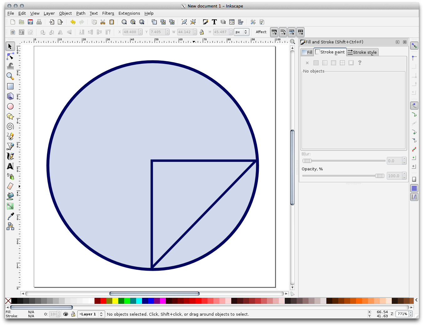
円 ツールを選択します。
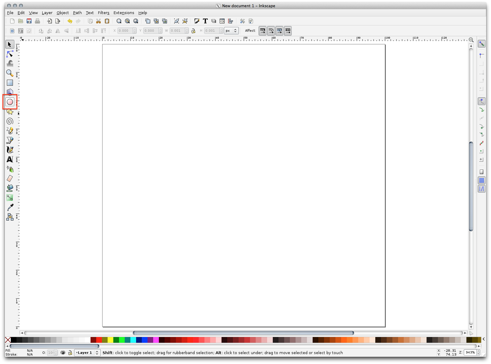
- Click and drag on the page to draw an ellipse. To make the ellipse turn into a circle, hold the ctrl button while you’re drawing it.
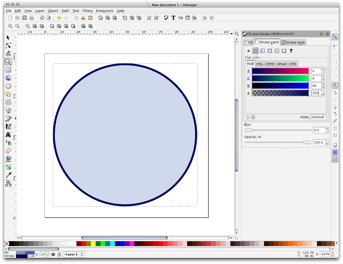
- Right-click on the circle you just created and open its Fill and Stroke:
- Change the Stroke paint to a pale grey-blue and the Stroke style to a darker color with thin stroke:
ライン ツールを実行中の間は線を描きます:
- Click once to start the line. Hold ctrl to make it snap to increments of 15 degrees.
- Click once to end the line segment, then right-click to finalize the line.
- Change its color and width to match the circle’s stroke and move it around as necessary, so that you end up with a symbol like this one:
- Save it as landuse_symbol under the directory that the course is in, under exercise_data/symbols, as an SVG file.
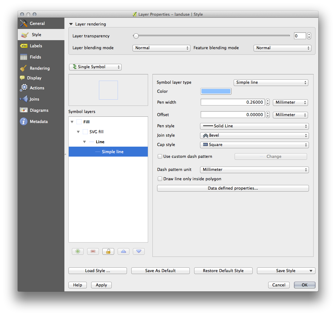
QGISでは:
- Open the Layer Properties for the landuse layer.
- Change the symbol structure to the following and find your SVG image via the Browse button:
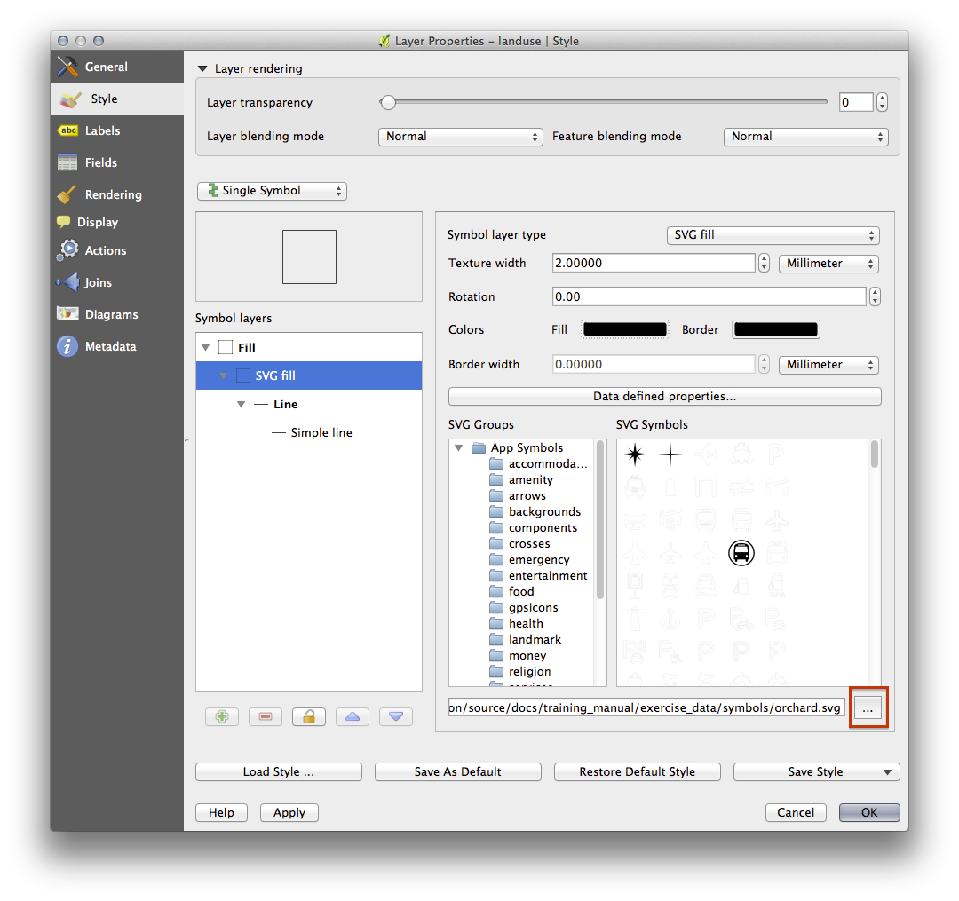
You may also wish to update the svg layer’s border:
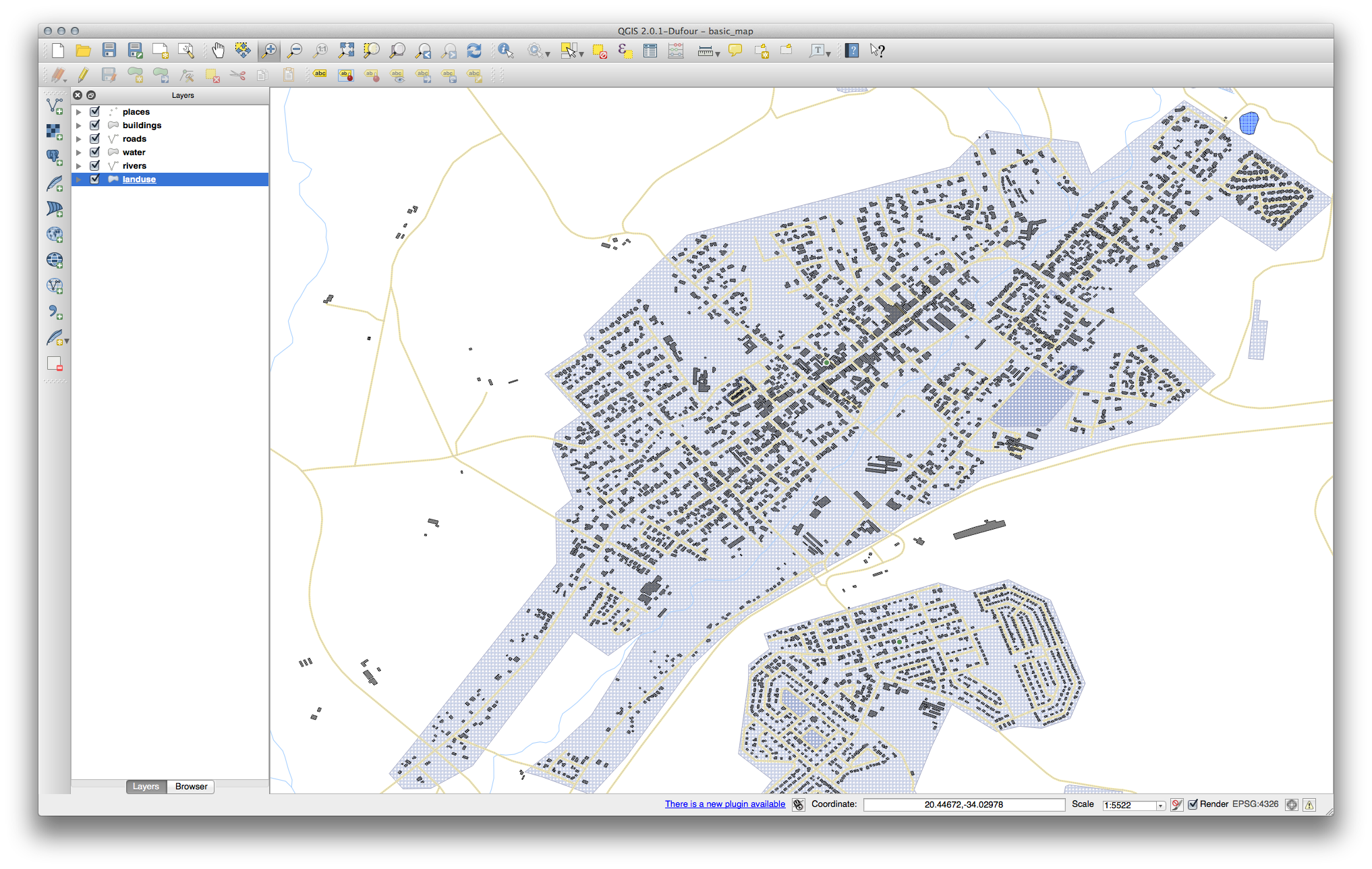
Your landuse layer should now have a texture like the one on this map:
3.2.13. In Conclusion
Changing the symbology for the different layers has transformed a collection of vector files into a legible map. Not only can you see what’s happening, it’s even nice to look at!
3.2.14. Further Reading
3.2.15. What’s Next?
Changing symbols for whole layers is useful, but the information contained within each layer is not yet available to someone reading these maps. What are the streets called? Which administrative regions do certain areas belong to? What are the relative surface areas of the farms? All of this information is still hidden. The next lesson will explain how to represent this data on your map.
ノート
最近のマップを保存するのを覚えてますか?