7.4. Lesson: 空間統計
ノート
Lesson developed by Linfiniti and S Motala (Cape Peninsula University of Technology)
空間統計では、分析し、与えられたベクタデータセットで何が起こっているかを理解することができます。 QGISは、この点で有用であることが分かる統計分析のためのいくつかの標準的なツールが含まれています。
**このレッスンの目標:**QGISの空間統計ツールの使い方を知ること。
7.4.1.  Follow Along: テストデータセットの作成
ポイントデータセットの操作を知るために、ポイントのランダムセットを作成します。
そのためには、ポイントを作成したいエリアの範囲を定義するポリゴンデータセットが必要です。
ストリートで覆われているエリアを使います。
空のマップを新規に開始します。
roads_34S レイヤと exercise_data/raster/SRTM/ にある srtm_41_19.tif raster (elevation data) を追加します。
ノート
あなたのSRTMのDEMレイヤは道路レイヤとは異なるCRSを持っていることがわかるかもしれません。その場合は、それ以前のこのモジュールの学んだ技術を使用して、道路またはDEMレイヤのいずれかを再投影することができます。
- Use the Convex hull(s) tool (available under Vector ‣ Geoprocessing Tools) to generate an area enclosing all the roads:
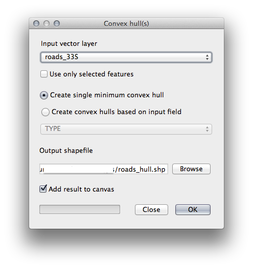
- Save the output under exercise_data/spatial_statistics/ as roads_hull.shp.
メッセージが表示されたらTOC (Layers list) に追加されます。
7.4.1.1. ランダム点群の作成
ベクタ ‣ 調査ツール ‣ ランダム点群 ツールを使用して、このエリアにランダム点群を作成します。
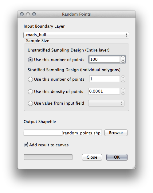
exercise_data/spatial_statistics/ 以下に random_points.shp として保存します。
メッセージが表示されたら(レイヤリスト)に追加します。
7.4.1.2. データのサンプリング
ラスタからサンプルデータセットを作成するため、 ポイントサンプルツール プラグインを使う必要があるでしょう。
必要に応じてプラグインで、モジュールを先に参照してください。
Plugin –> プラグインの管理とインストール... で point sampling というフレーズで検索し、このプラグインを見つけます。
プラグインマネージャ で有効化されたら、 プラグイン ‣ 分析 ‣ ポイントサンプリングツール を見つけることができます。
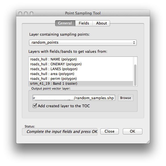
サンプル点群を含むレイヤを ランダム点群 として、SRTM ラスタを値を取得するバンドとして選択します。
“作成したレイヤをTOCに追加する”がチェックされていることを確認します。
exercise_data/spatial_statistics/ 以下に random_samples.shp を出力して保存します。
Now you can check the sampled data from the raster file in the attributes table of the random_samples layer, they will be in a column named srtm_41_19.tif.
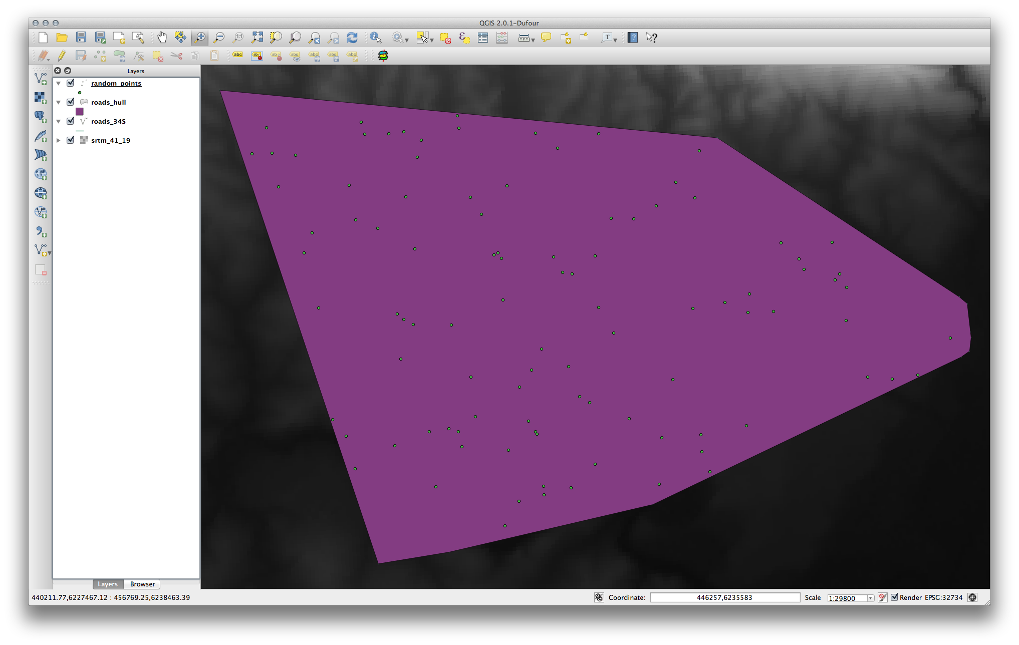
サンプルレイヤはここに示すとおりです:
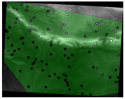
より暗い点が低い高度であるように、サンプル点はそれらの値によって分類されます。
あなたは、残りの統計エクササイズのためにこのサンプルレイヤを使っています。
7.4.2. Follow Along: 基本統計
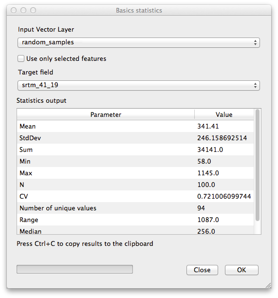
さて、このレイヤに対して基本統計を取得しましょう。
- Click on the Vector ‣ Analysis Tools ‣ Basic statistics menu entry.
- In the dialog that appears, specify the random_samples layer as the source.
- Make sure that the Target field is set to srtm_41_19.tif which is the field you will calculate statistics for.
OK をクリックします。結果はこのようになります。
ノート
You can copy and paste the results into a spreadsheet. The data uses a (colon :) separator.
実行後はプラグインダイアログを閉じます。
To understand the statistics above, refer to this definition list:
- 平均
- The mean (average) value is simply the sum of the values divided by the amount of values.
- StdDev
- The standard deviation. Gives an indication of how closely the values are clustered around the mean. The smaller the standard deviation, the closer values tend to be to the mean.
- 合計
すべての値を加算します。
- 最小
値の最小値です。
- 最大
値の最大値です。
- N
サンプル/値の量です。
- CV
データセットの spatial covariance
- ユニークな値の数
- The number of values that are unique across this dataset. If there are 90 unique values in a dataset with N=100, then the 10 remaining values are the same as one or more of each other.
- Range
最小および最大値間の差です。
- 中間値
- If you arrange all the values from least to greatest, the middle value (or the average of the two middle values, if N is an even number) is the median of the values.
7.4.3. Follow Along: 距離マトリクスの算出
- Create a new point layer in the same projection as the other datasets (WGS 84 / UTM 34S).
- Enter edit mode and digitize three point somewhere among the other points.
- Alternatively, use the same random point generation method as before, but specify only three points.
新規レイヤを distance_points.shp として保存します。
これらのポイントを使って距離マトリックスを生成します。
- Open the tool Vector ‣ Analysis Tools ‣ Distance matrix.
- Select the distance_points layer as the input layer, and the random_samples layer as the target layer.
このように設定します:
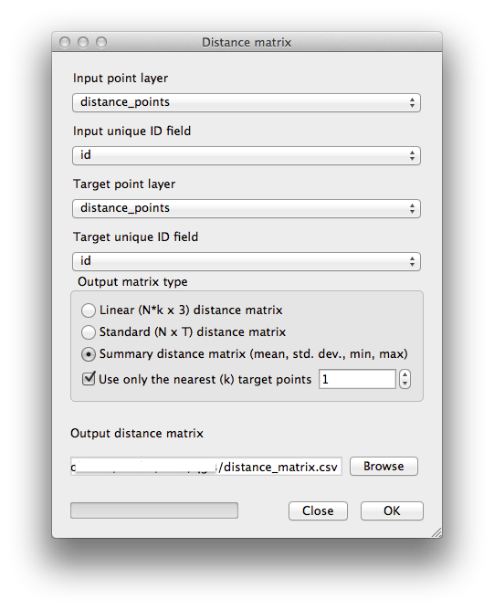
- Save the result as distance_matrix.csv.
OK をクリックし、距離マトリックスを生成します。
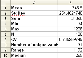
- Open it in a spreadsheet program to see the results. Here is an example:
7.4.4. Follow Along: 最小近傍分析
最小近傍分析を行うために:
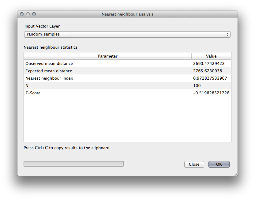
- Click on the menu item Vector ‣ Analysis Tools ‣ Nearest neighbor analysis.
- In the dialog that appears, select the random_samples layer and click OK.
- The results will appear in the dialog’s text window, for example:
ノート
You can copy and paste the results into a spreadsheet. The data uses a (colon :) separator.
7.4.5. Follow Along: 平均座標
データセットの平均座標を取得するために:
- Click on the Vector ‣ Analysis Tools ‣ Mean coordinate(s) menu item.
- In the dialog that appears, specify random_samples as the input layer, but leave the optional choices unchanged.
- Specify the output layer as mean_coords.shp.
- Click OK.
メッセージが表示されたら レイヤリスト に追加されます。
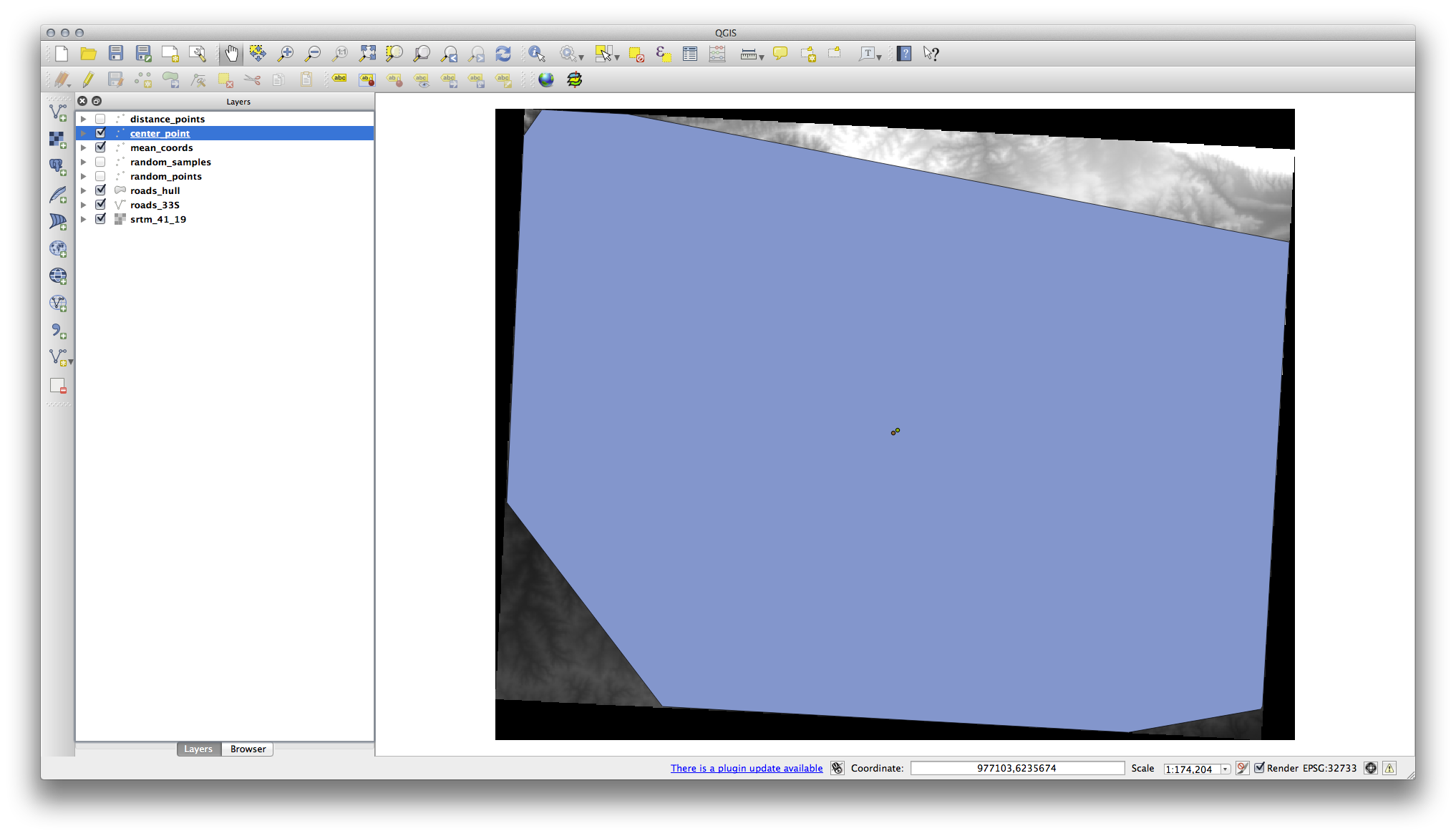
Let’s compare this to the central coordinate of the polygon that was used to create the random sample.
- Click on the Vector ‣ Geometry Tools ‣ Polygon centroids menu item.
- In the dialog that appears, select roads_hull as the input layer.
- Save the result as center_point.
メッセージが表示されたら(Layers list) に追加されます。
As you can see from the example below, the mean coordinates and the center of the study area (in orange) don’t necessarily coincide:
7.4.6. Follow Along: イメージヒストグラム
The histogram of a dataset shows the distribution of its values. The simplest way to demonstrate this in QGIS is via the image histogram, available in the Layer Properties dialog of any image layer.
- In your Layers list, right-click on the SRTM DEM layer.
プロパティ を選択します。
- Choose the tab Histogram. You may need to click on the Compute Histogram button to generate the graphic. You will see a graph describing the frequency of values in the image.
それをイメージとして出力できます:
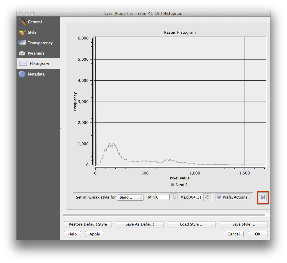
- Select the Metadata tab, you can see more detailed information inside the Properties box.
The mean value is 332.8, and the maximum value is 1699! But those values don’t show up on the histogram. Why not? It’s because there are so few of them, compared to the abundance of pixels with values below the mean. That’s also why the histogram extends so far to the right, even though there is no visible red line marking the frequency of values higher than about 250.
Therefore, keep in mind that a histogram shows you the distribution of values, and not all values are necessarily visible on the graph.
- (You may now close Layer Properties.)
7.4.7. Follow Along: 空間的補間
Let’s say you have a collection of sample points from which you would like to extrapolate data. For example, you might have access to the random_samples dataset we created earlier, and would like to have some idea of what the terrain looks like.
To start, launch the Grid (Interpolation) tool by clicking on the Raster ‣ Analysis ‣ Grid (Interpolation) menu item.
- In the Input file field, select random_samples.
- Check the Z Field box, and select the field srtm_41_19.
- Set the Output file location to exercise_data/spatial_statistics/interpolation.tif.
- Check the Algorithm box and select Inverse distance to a power.
- Set the Power to 5.0 and the Smoothing to 2.0. Leave the other values as-is.
- Check the Load into canvas when finished box and click OK.
- When it’s done, click OK on the dialog that says Process completed, click OK on the dialog showing feedback information (if it has appeared), and click Close on the Grid (Interpolation) dialog.
Here’s a comparison of the original dataset (left) to the one constructed from our sample points (right). Yours may look different due to the random nature of the location of the sample points.
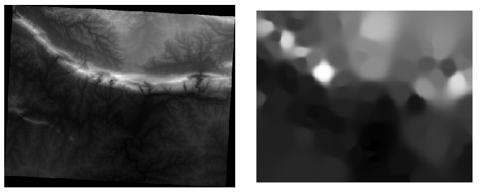
As you can see, 100 sample points aren’t really enough to get a detailed impression of the terrain. It gives a very general idea, but it can be misleading as well. For example, in the image above, it is not clear that there is a high, unbroken mountain running from east to west; rather, the image seems to show a valley, with high peaks to the west. Just using visual inspection, we can see that the sample dataset is not representative of the terrain.
7.4.8.  Try Yourself
- Use the processes shown above to create a new set of 1000 random points.
- Use these points to sample the original DEM.
- Use the Grid (Interpolation) tool on this new dataset as above.
- Set the output filename to interpolation_1000.tif, with Power and Smoothing set to 5.0 and 2.0, respectively.
The results (depending on the positioning of your random points) will look more or less like this:
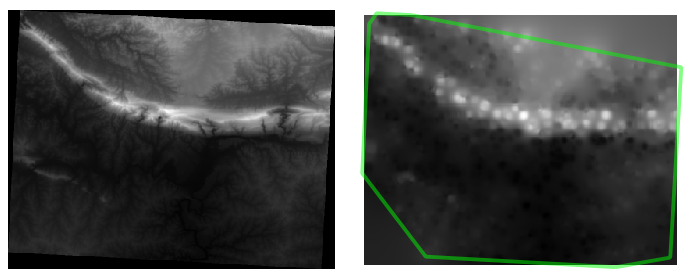
The border shows the roads_hull layer (which represents the boundary of the random sample points) to explain the sudden lack of detail beyond its edges. This is a much better representation of the terrain, due to the much greater density of sample points.
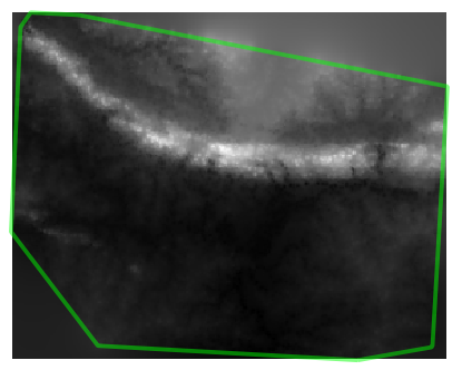
Here is an example of what it looks like with 10 000 sample points:
ノート
It’s not recommended that you try doing this with 10 000 sample points if you are not working on a fast computer, as the size of the sample dataset requires a lot of processing time.
7.4.9. Follow Along: 追加の空間統計ツール
Originally a separate project and then accessible as a plugin, the SEXTANTE software has been added to QGIS as a core function from version 2.0. You can find it as a new QGIS menu with its new name Processing from where you can access a rich toolbox of spatial analysis tools allows you to access various plugin tools from within a single interface.
- Activate this set of tools by enabling the Processing ‣ Toolbox menu entry. The toolbox looks like this:
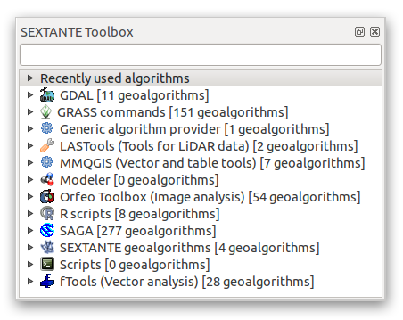
You will probably see it docked in QGIS to the right of the map. Note that the tools listed here are links to the actual tools. Some of them are SEXTANTE’s own algorithms and others are links to tools that are accessed from external applications such as GRASS, SAGA or the Orfeo Toolbox. This external applications are installed with QGIS so you are already able to make use of them. In case you need to change the configuration of the Processing tools or, for example, you need to update to a new version of one of the external applications, you can access its setting from Processing ‣ Options and configurations.
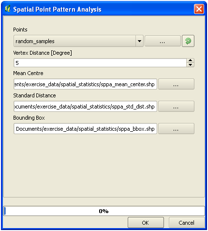
7.4.10. Follow Along: Spatial Point Pattern Analysis
For a simple indication of the spatial distribution of points in the random_samples dataset, we can make use of SAGA’s Spatial Point Pattern Analysis tool via the Processing Toolbox you just opened.
- In the Processing Toolbox, search for this tool Spatial Point Pattern Analysis.
ダブルクリックしそのダイアログを開きます。
7.4.10.1. SAGAのインストール
ノート
If SAGA is not installed on your system, the plugin’s dialog will inform you that the dependency is missing. If this is not the case, you can skip these steps.
7.4.10.2. Windowsで
Included in your course materials you will find the SAGA installer for Windows.
- Start the program and follow its instructions to install SAGA on your Windows system. Take note of the path you are installing it under!
Once you have installed SAGA, you’ll need to configure SEXTANTE to find the path it was installed under.
- Click on the menu entry Analysis ‣ SAGA options and configuration.
- In the dialog that appears, expand the SAGA item and look for SAGA folder. Its value will be blank.
- In this space, insert the path where you installed SAGA.
7.4.10.3. Ubuntu で
- Search for SAGA GIS in the Software Center, or enter the phrase sudo apt-get install saga-gis in your terminal. (You may first need to add a SAGA repository to your sources.)
- QGIS will find SAGA automatically, although you may need to restart QGIS if it doesn’t work straight away.
7.4.10.4. Macで
Homebrew users can install SAGA with this command:
saga-coreのBREWインストール
If you do not use Homebrew, please follow the instructions here:
http://sourceforge.net/apps/trac/saga-gis/wiki/Compiling%20SAGA%20on%20Mac%20OS%20X
7.4.10.5. インストール後
Now that you have installed and configured SAGA, its functions will become accessible to you.
7.4.10.6. SAGAの利用
SAGAダイアログを開きます。
- SAGA produces three outputs, and so will require three output paths.
- Save these three outputs under exercise_data/spatial_statistics/, using whatever file names you find appropriate.
The output will look like this (the symbology was changed for this example):
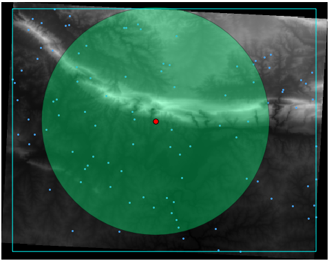
The red dot is the mean center; the large circle is the standard distance, which gives an indication of how closely the points are distributed around the mean center; and the rectangle is the bounding box, describing the smallest possible rectangle which will still enclose all the points.
7.4.11. Follow Along: 最小距離分析
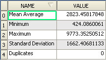
Often, the output of an algorithm will not be a shapefile, but rather a table summarizing the statistical properties of a dataset. One of these is the Minimum Distance Analysis tool.
- Find this tool in the Processing Toolbox as Minimum Distance Analysis.
It does not require any other input besides specifying the vector point dataset to be analyzed.
- Choose the random_points dataset.
- Click OK. On completion, a DBF table will appear in the Layers list.
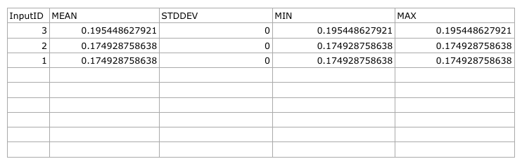
- Select it, then open its attribute table. Although the figures may vary, your results will be in this format:
7.4.12. In Conclusion
QGIS allows many possibilities for analyzing the spatial statistical properties of datasets.
7.4.13. What’s Next?
Now that we’ve covered vector analysis, why not see what can be done with rasters? That’s what we’ll do in the next module!