.
ラスタのプロパティダイアログ
ラスタレイヤのプロパティを表示および設定するには、マップの凡例でレイヤ名をダブルクリックするか、レイヤ名をクリックし、コンテキストメニューから プロパティ を選択してください.これによって Raster Layer Properties ダイアログが開きます ( figure_raster_1 参照).
このダイアログには多くのメニューがあります:
一般情報
スタイル
透過性
ピラミッド
ヒストグラム
メタデータ
Figure Raster 1:
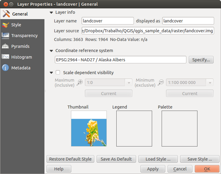
ラスタレイヤプロパティダイアログ 
スタイルメニュー
バンドレンダリング
QGIS は4種類の異なる Render types を提供します. レンダラの選択はデータタイプに依存します.
マルチバンドカラー - ファイルが多くのバンドを持つとマルチバンドになります (例., 多くのバンドを持つ衛星イメージ)
パレットを使った- シングルバンドファイルがインデックスされたパレットを使う場合 (例., デジタルトポグラフィックマップで利用する場合)
シングルバンドグレイ - (ひとつのバンドの) イメージが灰色でレンダリングされます; QGIS はファイルがマルチバンドで無い場合とインデックスパレットか連続色パレットでない場合このレンダラを選択します (例., 陰影図で使われます)
シングルバンド擬似カラー - このレンダーは連続色パレットかカラーマップで利用できます(例., 標高マップでの利用)
マルチバンドカラー
マルチバンドカラーレンダラーではイメージから赤、緑、青をあらわす3つのバンドが選択され描画されます. コントラスト拡張 で methods: ‘No enhancement’, ‘Stretch to MinMax’, ‘Stretch and clip to MinMax’ と ‘Clip to min max’ などのメソッドを選択できます.
Figure Raster 2:
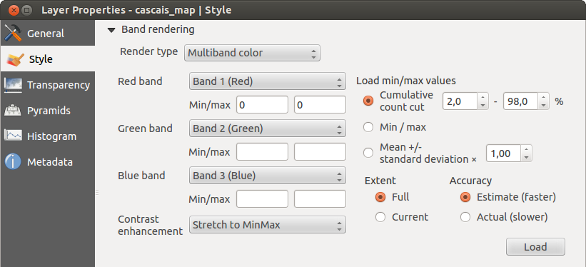
ラスタレンダ - マルチバンドカラー
この選択はあなたのラスタレイヤの表示を変更する幅広いオプションが提供されます.最初にあなたのイメージからデータレンジを取得する必要があります.これは Extent を選択して [Load] を押すと実行できます. QGIS では  Estimate (faster) バンドの値の Min と Max または
  Actual (slower) Accuracy を利用できます.
Now you can scale the colors with the help of the Load min/max values section.
A lot of images have a few very low and high data. These outliers can be eliminated
using the Cumulative count cut setting. The standard data range is set
from 2% to 98% of the data values and can be adapted manually. With this
setting, the gray character of the image can disappear.
With the scaling option Min/max, QGIS creates a color table with all of
the data included in the original image (e.g., QGIS creates a color table
with 256 values, given the fact that you have 8 bit bands).
You can also calculate your color table using the Mean +/- standard deviation x  .
Then, only the values within the standard deviation or within multiple standard deviations
are considered for the color table. This is useful when you have one or two cells
with abnormally high values in a raster grid that are having a negative impact on
the rendering of the raster.
.
Then, only the values within the standard deviation or within multiple standard deviations
are considered for the color table. This is useful when you have one or two cells
with abnormally high values in a raster grid that are having a negative impact on
the rendering of the raster.
すべての計算は Current 領域に対してのみの設定もできます.
ちなみに
マルチバンドラスタの単バンドを表示する
If you want to view a single band of a multiband image (for example, Red), you might think you would set the Green and Blue bands to “Not Set”. But this is not the correct way. To display the Red band, set the image type to ‘Singleband gray’, then select Red as the band to use for Gray.
パレット
This is the standard render option for singleband files that already include a color table, where each pixel value is assigned to a certain color. In that case, the palette is rendered automatically. If you want to change colors assigned to certain values, just double-click on the color and the Select color dialog appears. Also, in QGIS 2.2. it’s now possible to assign a label to the color values. The label appears in the legend of the raster layer then.
Figure Raster 3:
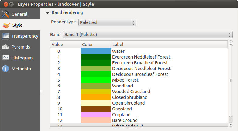
ラスタレンダラ - パレット
コントラスト強調
ノート
When adding GRASS rasters, the option Contrast enhancement will always be set automatically to stretch to min max, regardless of if this is set to another value in the QGIS general options.
シングルバンドグレイ
This renderer allows you to render a single band layer with a Color gradient:
‘Black to white’ or ‘White to black’. You can define a Min
and a Max value by choosing the Extent first and
then pressing [Load]. QGIS can Estimate (faster) the
Min and Max values of the bands or use the
Actual (slower) Accuracy.
Figure Raster 4:
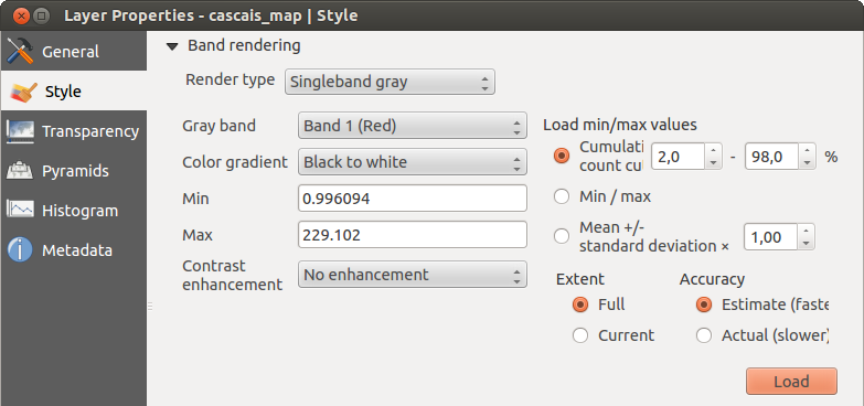
ラスタレンダラ - シングルバンドグレイ
With the Load min/max values section, scaling of the color table
is possible. Outliers can be eliminated using the Cumulative count cut setting.
The standard data range is set from 2% to 98% of the data values and can
be adapted manually. With this setting, the gray character of the image can disappear.
Further settings can be made with Min/max and
Mean +/- standard deviation x .
While the first one creates a color table with all of the data included in the
original image, the second creates a color table that only considers values
within the standard deviation or within multiple standard deviations.
This is useful when you have one or two cells with abnormally high values in
a raster grid that are having a negative impact on the rendering of the raster.
シングルバンド疑似カラー
これは連続したパレットを含むシングルバンドファイルのレンダーオプションです。ここで、シングルバンドの個々のカラーマップを作成することもできます。
Figure Raster 5:
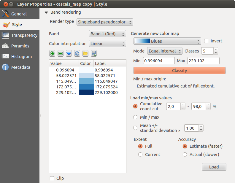
ラスタレンダ - シングルバンド疑似カラー
3種類の色補間方法が利用できます:
個別の
線形
正確な
In the left block, the button  Add values manually adds a value to the
individual color table. The button
Add values manually adds a value to the
individual color table. The button  Remove selected row
deletes a value from the individual color table, and the
Remove selected row
deletes a value from the individual color table, and the
 Sort colormap items button sorts the color table according
to the pixel values in the value column. Double clicking on the value column lets
you insert a specific value. Double clicking on the color column opens the dialog
Change color, where you can select a color to apply on that value. Further,
you can also add labels for each color, but this value won’t be displayed when you use the identify
feature tool.
You can also click on the button
Sort colormap items button sorts the color table according
to the pixel values in the value column. Double clicking on the value column lets
you insert a specific value. Double clicking on the color column opens the dialog
Change color, where you can select a color to apply on that value. Further,
you can also add labels for each color, but this value won’t be displayed when you use the identify
feature tool.
You can also click on the button  Load color map from band,
which tries to load the table from the band (if it has any). And you can use the
buttons
Load color map from band,
which tries to load the table from the band (if it has any). And you can use the
buttons  Load color map from file or
  Export color map to file to load an existing color table or to save the
defined color table for other sessions.
Export color map to file to load an existing color table or to save the
defined color table for other sessions.
In the right block, Generate new color map allows you to create newly
categorized color maps. For the Classification mode  ‘Equal interval’,
you only need to select the number of classes
and press the button Classify. You can invert the colors
of the color map by clicking the
‘Equal interval’,
you only need to select the number of classes
and press the button Classify. You can invert the colors
of the color map by clicking the  Invert
checkbox. In the case of the Mode ‘Continous’, QGIS creates
classes automatically depending on the Min and Max.
Defining Min/Max values can be done with the help of the Load min/max values section.
A lot of images have a few very low and high data. These outliers can be eliminated
using the Cumulative count cut setting. The standard data range is set
from 2% to 98% of the data values and can be adapted manually. With this
setting, the gray character of the image can disappear.
With the scaling option Min/max, QGIS creates a color table with all of
the data included in the original image (e.g., QGIS creates a color table
with 256 values, given the fact that you have 8 bit bands).
You can also calculate your color table using the Mean +/- standard deviation x .
Then, only the values within the standard deviation or within multiple standard deviations
are considered for the color table.
Invert
checkbox. In the case of the Mode ‘Continous’, QGIS creates
classes automatically depending on the Min and Max.
Defining Min/Max values can be done with the help of the Load min/max values section.
A lot of images have a few very low and high data. These outliers can be eliminated
using the Cumulative count cut setting. The standard data range is set
from 2% to 98% of the data values and can be adapted manually. With this
setting, the gray character of the image can disappear.
With the scaling option Min/max, QGIS creates a color table with all of
the data included in the original image (e.g., QGIS creates a color table
with 256 values, given the fact that you have 8 bit bands).
You can also calculate your color table using the Mean +/- standard deviation x .
Then, only the values within the standard deviation or within multiple standard deviations
are considered for the color table.
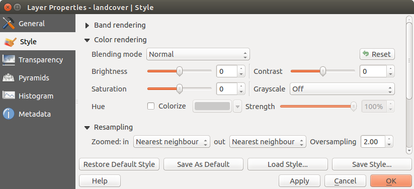
カラーレンダリング
それぞれについて Band rendering, Color rendering が利用可能です.
You can also achieve special rendering effects for your raster file(s) using one of the blending modes (see ベクタプロパティダイアログ).
Further settings can be made in modifiying the Brightness, the Saturation and the Contrast. You can also use a Grayscale option, where you can choose between ‘By lightness’, ‘By luminosity’ and ‘By average’. For one hue in the color table, you can modify the ‘Strength’.
リサンプリング
The Resampling option makes its appearance when you zoom in and out of an image. Resampling modes can optimize the appearance of the map. They calculate a new gray value matrix through a geometric transformation.
Figure Raster 6:
ラスタレンダリング- リサンプリング
When applying the ‘Nearest neighbour’ method, the map can have a pixelated structure when zooming in. This appearance can be improved by using the ‘Bilinear’ or ‘Cubic’ method, which cause sharp features to be blurred. The effect is a smoother image. This method can be applied, for instance, to digital topographic raster maps.
透過性メニュー
QGIS has the ability to display each raster layer at a different transparency level.
Use the transparency slider  to indicate to what extent the underlying layers
(if any) should be visible though the current raster layer. This is very useful
if you like to overlay more than one raster layer (e.g., a shaded relief map
overlayed by a classified raster map). This will make the look of the map more
three dimensional.
to indicate to what extent the underlying layers
(if any) should be visible though the current raster layer. This is very useful
if you like to overlay more than one raster layer (e.g., a shaded relief map
overlayed by a classified raster map). This will make the look of the map more
three dimensional.
Additionally, you can enter a raster value that should be treated as NODATA in the Additional no data value menu.
An even more flexible way to customize the transparency can be done in the Custom transparency options section. The transparency of every pixel can be set here.
As an example, we want to set the water of our example raster file landcover.tif to a transparency of 20%. The following steps are neccessary:
ラスタファイルのロード landcover.tif.
凡例のラスタ名称をダブルクリックするか右ボタンクリックでポップアップメニューから Properties を選択して Properties ダイアログを開いて下さい.
透過性 メニューを選択して下さい.
透過設定するバンド メニューから ‘なし’ を選んでください.
- Click the Add values manually
button. A new row will appear in the pixel list.
- Enter the raster value in the ‘From’ and ‘To’ column (we use 0 here), and adjust the transparency to 20%.
[Apply] ボタンを押し,マップを見ます。
You can repeat steps 5 and 6 to adjust more values with custom transparency.
As you can see, it is quite easy to set custom transparency, but it can be
quite a lot of work. Therefore, you can use the button  Export to file to save your transparency list to a file. The button
Import from file loads your transparency settings and
applies them to the current raster layer.
Export to file to save your transparency list to a file. The button
Import from file loads your transparency settings and
applies them to the current raster layer.
ピラミッドメニュー
Large resolution raster layers can slow navigation in QGIS. By creating lower resolution copies of the data (pyramids), performance can be considerably improved, as QGIS selects the most suitable resolution to use depending on the level of zoom.
ピラミッドを作成するには、オリジナル画像があるディレクトリへの書き込み権限を持っている必要があります。
ピラミッドの計算には多くのリサンプリングメソッドを利用できます:
最近傍
平均
ガウス
キュービック
モード
なし
If you choose ‘Internal (if possible)’ from the Overview format menu, QGIS tries to build pyramids internally. You can also choose ‘External’ and ‘External (Erdas Imagine)’.
Figure Raster 7:
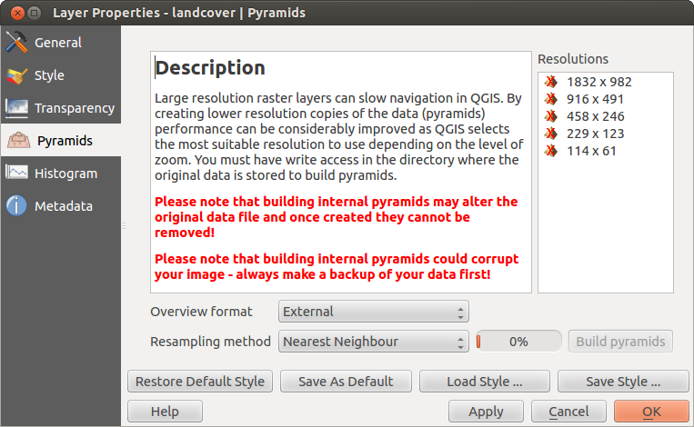
ピラミッドメニュー
Please note that building pyramids may alter the original data file, and once created they cannot be removed. If you wish to preserve a ‘non-pyramided’ version of your raster, make a backup copy prior to building pyramids.
ヒストグラムメニュー
The Histogram menu allows you to view the distribution of the bands
or colors in your raster. The histogram is generated automatically when you open the
Histogram menu. All existing bands will be displayed together. You can
save the histogram as an image with the button.
With the Visibility option in the  Prefs/Actions menu,
you can display histograms of the individual bands. You will need to select the option
Show selected band.
The Min/max options allow you to ‘Always show min/max markers’, to ‘Zoom
to min/max’ and to ‘Update style to min/max’.
With the Actions option, you can ‘Reset’ and ‘Recompute histogram’ after
you have chosen the Min/max options.
Prefs/Actions menu,
you can display histograms of the individual bands. You will need to select the option
Show selected band.
The Min/max options allow you to ‘Always show min/max markers’, to ‘Zoom
to min/max’ and to ‘Update style to min/max’.
With the Actions option, you can ‘Reset’ and ‘Recompute histogram’ after
you have chosen the Min/max options.
Figure Raster 8:
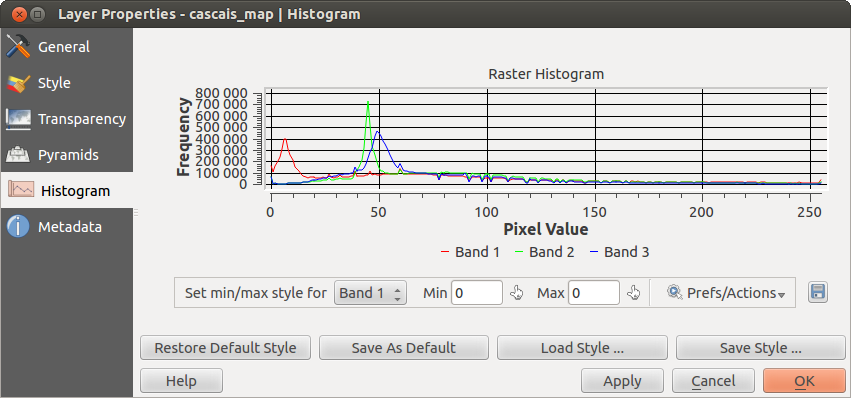
ラスタヒストグラム
メタデータメニュー
The Metadata menu displays a wealth of information about the raster layer, including statistics about each band in the current raster layer. From this menu, entries may be made for the Description, Attribution, MetadataUrl and Properties. In Properties, statistics are gathered on a ‘need to know’ basis, so it may well be that a given layer’s statistics have not yet been collected.
Figure Raster 9:
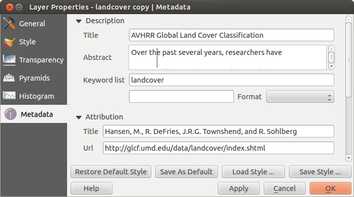
ラスタメタデータ